


Select Your Favourite
Category And Start Learning.
Unbreakable Laws Of
UX Design
UX designers come up with creative and innovative ideas to make the user experience a desirable and comfortable one. But there are certain rules to be followed to make a UX effective and successful. There are 7 important laws to be known by all UX designers that are based on customer psychology.
Let's start looking into the 7 laws.
LAWS OF UX DESIGN
1.Von Restorff Effect (or) Isolation Effect
“A theory that predicts that when things like things are present at the same time, the object with the most difference will be remembered”

By this effect, it is possible to distinguish key information or actions in UX design. The call-to-action buttons are always brightly coloured so that they stand out from other options on a website.
For example, the app notifications are red coloured so that they can catch the user’s attention easily.
2.Hick’s Law
"Decision making takes longer when there are more choices and they are more complex"
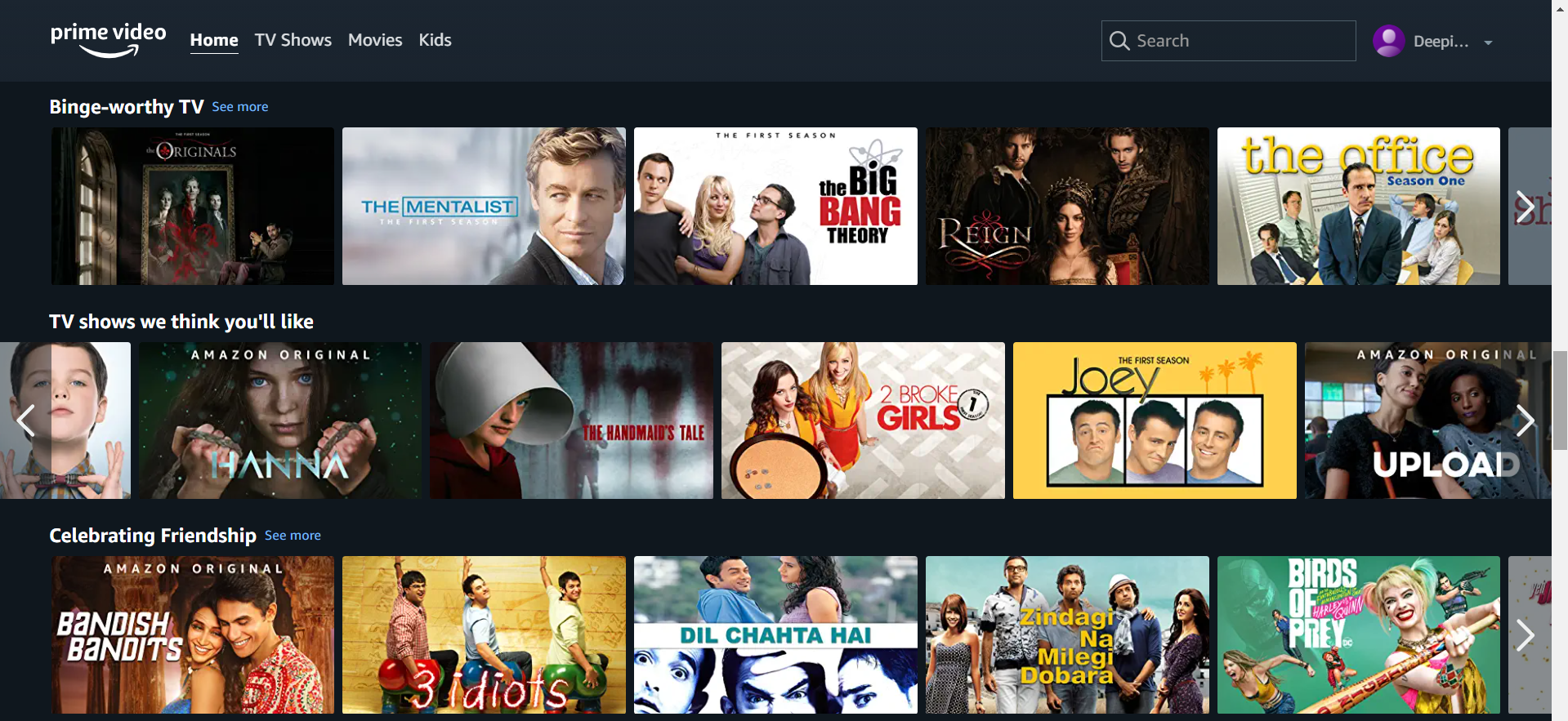
If there are many choices users may be confused and take more time to make a choice. So, it is better to limit the choices. For example, Amazon Prime provides limited choices in different categories.
However, it is not always the fewer choices that result in a better user experience, but rather the appropriate placement of these choices at the right time. In order to ensure that your users connect with and engage with your service or product, you must leverage choice and reaction time.
3.Fitt’s Law
“The longer the distance and the smaller the target's size, the longer it takes.”
A number of factors impact the user's experience regarding a target's size and distance from where the user is currently positioned. So placing important interaction buttons on a place where users can reach without difficulty and bigger size of the button will make UX easy.

For example, here the main functionality button is placed at the centre of the page and also it is larger than other options available.
4.Zeigarnik Effect
“People remember uncompleted or interrupted tasks better than completed tasks”
As humans, we have a desire for the end. Once given a task, tension builds up to complete it. This tension persists when we have unfinished tasks. So this tension is used to make the user use the product more.

As an example, Simply Learn lets you see the progress of your course. This is the visual translation of the Zeigarnik Effect.
5.Serial Position Effect
“The first and the last terms are most likely remembered.”
Users concentrate more on the first and last thing in a list. Placing more important features on the beginning and end will help to gain the
user’s attention.

For example, the important shopping categories are placed at the top of the dropdown box in Amazon.
6.Law of Common Region
"Elements that share a boundary with a defined area are viewed as forming a group."
In UX design, establishing a common region for related elements helps people quickly and accurately understand groupings.

For example, In Moodle website, the important categories are grouped and displayed to the left in a rectangular region.
7.Law of Proximity
“Objects located close together tend to be grouped together.”
By relating information to proximity, users understand and organize it more quickly and efficiently. Communication is aided when groupings are communicated with varying amounts of whitespace.

For example, in Coursera, the extra whitespace to the right of the Search button separates it from the rest of the options and identifies it as a different type of functionality.
These are all the laws one should know about UX design.
'Until next time.

Follow us on your favourite social platform
